Part 2
When I began this CNC Sign Project design I had a dilemma. Ashlee originally requested a sign with a generic picture of a Holstein cow. She did not have a really good grasp on exactly what she wanted she just wanted a sign. I think that not knowing what you want is probably a big problem for most sign customers. They know they want a sign but they expect the sign maker to be able to create the design and know what looks good. For me my real dilemma is that I am not a graphic designer. Sure I have a little art skills but no formal training. Lack of training seldom stops a Maker from giving it a shot. But a wise maker knows how to get just in time training with the help of the Internet. There are several great website about sign making which can help you learn some basic skills. Here are a few:
http://signpig.com
http://signs101.com – Professionals and students only.
http://www.creativesignmakers.com/
http://www.signoholics.com/s_forum/
http://www.vectric.com/forum/
HOW I USED ADOBE PHOTOSHOP
After about a month of waiting for artwork I took the bull by the horn (actually these are cows and they don’t have horns…. But that’s not important) and grabbed my trusty Canon XTi Camera and took some photos of Ashlee’s cows Margarita and Bolton. If you have never tried to take pictures of cows, you should know that Cows are not easy to photograph. They move around a lot and do weird things like lick their faces or text while driving. Anyway I eventually got some shots that I thought I could use. I loaded these pictures into Adobe Photoshop began editing. New Dilemma: I don’t know a whole lot about Photoshop. I knew how to crop a picture but removing all of the background from a picture was still hit or miss for me. Luckily I used the help files in Photoshop CS5 and found a found a very good video on YouTube that explained how to do the process the easy way. The Russell Brown Show has tutorials that will speed you through learning Adobe Photoshop tricks. I included a link below.
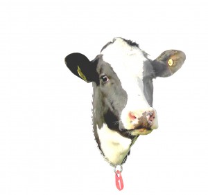
With my new knowledge in hand I took the picture at the top of the page and cropped it so that only one cow was visible with no background. Then I looked at the picture and decided that I would borrow a page from Bordens and Elmers Glue and just use the cow head as the picture. So I clipped away the rest of Margaraitas’s body using her color as the border. This turned out to be a good and bad decision. It was good because it created a natural frame. bad because the links are reflective and tended to disappear when I was trying to trim the photo. The next problem I had to overcome was that Margarita’s face was very dark on one side and didn’t show a lot of details. To fix this I played with the channels in Photoshop to selectively lighten areas of the image. This worked better than lightening the entire because it would be washed out.
There were only a few more tweaks I had to make to the image. Those included removing the ear tags and also lightening up the cows left ear. I felt that doing this would draw the eye from dark to light and cause people to look towards the text of the sign. I really learned a lot about Photo shop during the course of this project. One book that helped me was really designed for Photoshop Elements but worked just as well with Photoshop; “How to Cheat In PhotoShop Elements“. I really like the way this book cuts out all the fat and just give you what you need.
Tomorrow I will talk about the design software I used to make the sign and also show a preliminary design. Thanks for reading. Please let me know if you have a suggestion or comment or if I don’t go into enough detail.
CNC SIGN PROJECTS:


[…] PART TWO […]
Bill, great web page, love the layout!!! Thanks for shareing!
AL
Thanks Al,
You are an inspiration to me. I love looking at you projects.
BIll
[…] PART TWO […]
[…] PART TWO […]